What's Old is New Again
“Hey! Who put this backdoor in my Wordpress?”
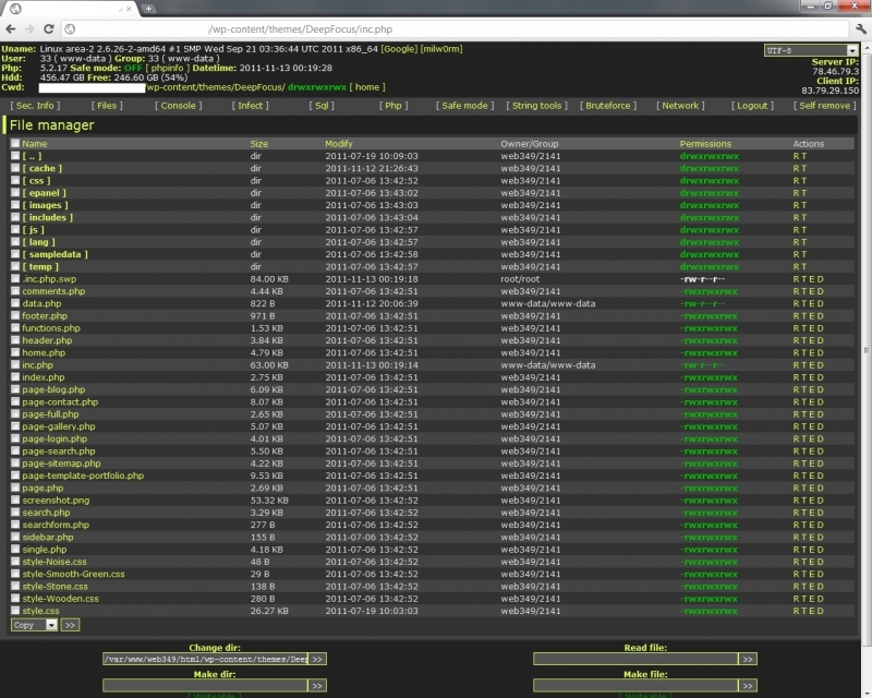
The "FilesMan" Backdoor: May get more traffic than most of my posts.
Sadly, I've had to ask myself that question on more than one occasion.
What kind of heroic effort does it take to maintain a malware-free Wordpress installation these days? I may not have the strongest sysadmin skills, but I keep Wordpress up-to-date. I back up my site regularly. I have strong passwords. I floss.
What more do I need to do?
Old School
One of the simplest Web sites I ever built was for my daughter's preschool, Irvington
Montessori. (Can only be seen in the Wayback Machine now.) To create it, I wrote one HTML
template with a single variable: $content. The actual content (in HTML) was kept in a
directory of files, one file per Web page. Then, to generate the Web site, I had a Make script
that would go through each file, and substitute the file contents for $content in the
template.
That's what blogging with Jekyll reminds me of.
And, for my simple needs, it should be a perfect solution, with so much less for me to worry about. No more databases. No more PHP. No more hidden links to Russian porn sites buried at the bottom of blog posts.
It may not be in my preferred Python, but I like that it's so popular that it's not going to be abandoned any time soon, and as I spend more time on Github, I figure it doesn't hurt to be familiar with their Jekyll-based gh-pages.
Uh-oh…Design
Writing in Markdown is great and all, but you've still got to make your posts look good on the screen. For me, that's where trouble begins. I began to miss Wordpress themes almost immediately. Even if I spend way too much time mulling over Wordpress theme choices, never quite happy with this little thing or that, it's still a blessing that once you pick a theme, you're done and ready to move on.
Design isn't my strong suit. And, starting with a blank screen makes the challenge that much more daunting.
Seeking to shortcut the design process, I investigated Octopress and jekyll-bootstrap. Both, were very nice projects, and I was particularly taken with this theme by Mark Reid. Using it, I mocked up a prototype of my blog, and proudly demo'ed it for my wife.
“You can't just copy somebody else. You have to have your own look!”
So much for avoiding design. Back to the blank screen.
Minimal (Primitive?) Layout
I thought briefly of starting with one of the more popular HTML frameworks, like Twitter's Bootstrap, or Skeleton, but ultimately decided that even they were overkill for what I wanted: a single column layout. And, rather than implementing a responsive design, I hoped to achieve most of the benefits (looking good in a wide variety of screen sizes) with a simpler flexible layout with a max-width. (I love the examples of the dynamically resized photos, but that idea is a little too ambitious for me right now. Maybe next iteration.)
One idea that I've always wanted to experiment with is structuring every blog post in classic “Journalist 101” style. Each post should have a Hed (headline), a Dek (sub-heading), and a Lede (first paragraph, that hooks the reader). Jon Udell has been writing about this idea forever, and like him, I wish that more writing on the Web followed this model, because it provides much more context than a bare headline when scanning posts on an Archive page or in an RSS reader so much richer.
I'm going to Solarize Everything
Having the basic page structure in place, that meant it was time to dress it up with color. Usually, my idea of a bold color scheme is to add a splash of red or blue to an otherwise black, white and gray layout.
But, I've branched out a little here, since this blog design process just happens to coincide with a period of fascination with Ethan Schoonover's Solarized project. Here's a set of colors that were decidedly not just slapped together because “they look pretty good.” No, it's exhaustively documented and well-reasoned. It's got symmetry, where the light version of the color scheme and the dark version are reverse images of each other, and it has gradually taken over my computer. In my editor, I utilize the light theme, while Terminal gets the dark theme.
Solarized is obviously the product of an obsession, and one thing I know about myself is that I'm a sucker for in-depth obsessiveness. Over the years, I've learned to cook thanks to Cook's Illustrated and their process of testing like 50 permutations of every recipe they present. I mean, there's a reason I bookmark posts like a two-part series on choosing the "ideal nethergarments for men": “Boxer Briefs” and “Boxer Briefs, Part II: The Briefening”. How can you argue with such a comprehensively argued case?
So, given that I've totally bought into Ethan's case for the ultimate color scheme, why not give my blog the same Solarized treatment?
(And now that I've launched this new design, maybe it's time to head to the Patagonia nethergarment section.)